Artists
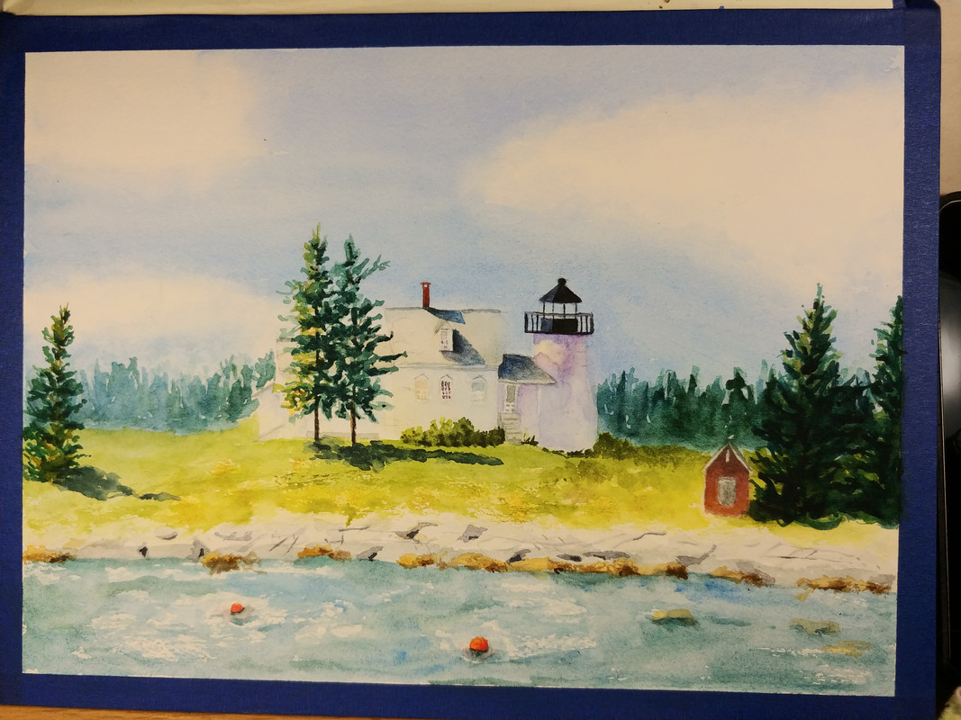
Related: About this forumNeed help. Should I get darker in the water? Lighten the trees on the right? Play with the house
some more? It's a present for my Aunt. The lighthouse back home. She doesn't travel much any more and I'm sure she'd appreciate the memory.
This is watercolor. I do have gouache and pastels if I can't fix it any other way. (like the too dark trees on the right.)

dweller
(25,052 posts)Is almost fading away, whereas the lighthouse is color/shaded, maybe more distinction btwn roof and house ?
nice work all the same
✌🏻
Pobeka
(4,999 posts)Yes, some highlights on branches to the trees on the right. Just a little bit.
The house is getting lost behind the trees -- perhaps some fine line darkening of the gutterlines might be enough to carry it through.
The water -- maybe a little darker blue, but not if it doesn't keep with the integrity of the actual water color.
I'm always impressed with real artists like you. I'm neither a real one or a fake one!
I am sure your aunt will love this.
LunaSea
(2,927 posts)could use more contrast. Perhaps find some reference photos with a similar lighting angle.
(think a lot of small patches of darker reflections across the whole of the water foreground as opposed to
a solid value change)
You've done a nice job of establishing where the sun is on the left and center, but the right 3rd is lacking the haze toward the back and no detail/highlights on those trees don't really match the 3 trees on the left. Left 2/3rds has a nice atmosphere. Assuming its watercolor, a little spritz on water and some dabbing would pull up some of the darkness way in the back.
And maybe the tree with ears above the little shed kinda bugs me.
I bet you're going to make your aunt smile!
sinkingfeeling
(52,996 posts)need highlights.
Laelth
(32,017 posts)I would darken the shadows on the structure.
Closer = more saturation. Farther away = less saturation.
It’s beautiful. Best of luck. It’s virtually impossible to “fix” watercolor—unforgiving medium.
-Laelth
fierywoman
(8,105 posts)beautifully. I wouldn't mess with the water! If you want something in the foreground to be stronger, try the rocks (which are also very fine, btw.) Have you squinted to see where you might want to go from here? When I do, I would like to see some soft edges and some greyed-out places. But keep hard edges between background trees at the house on either side (maybe darken the background trees to the left of the house and keep the edge hard to make the house "pop."![]() I really like how you haven't gone into too much picky detail.
I really like how you haven't gone into too much picky detail.
![]()
![]()
handmade34
(22,925 posts)on trees to the right
stronger delineation between water and yard
a bit more color to the house
all that said, the picture is lovely
secondwind
(16,903 posts)you can outline the rocks here and there, and the house...... it’s just another “look”.
I really like your very gentle way of painting....
marble falls
(62,068 posts)Last edited Mon Jan 18, 2021, 08:00 PM - Edit history (1)
lunatica
(53,410 posts)Then go from there.
I like the lightness and luminescence and glow.
GemDigger
(4,327 posts)looks like a very early spring morning when everything looks washed by the brightness of the sun. The grass is not quite the deep green of summer and the water looks like cold winter runoff.