Artists
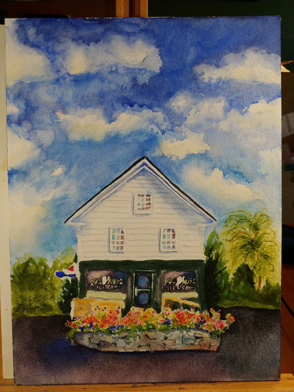
Related: About this forumPutting last touches on the Charity auction piece. Should I ink more of it like I did the lettering,
Last edited Mon Jun 15, 2020, 07:50 AM - Edit history (1)
or leave it as is? Obviously I do a lot of line and wash, partly because there's more tolerance for wiggly lines and odd washes. But I didn't want to go any further without some suggestions. Ink will definitely make it pop, but hard lines can hurt the dreamy softness.
Also, I still have the sign in the center and power lines to contend with. I can keep the sign pretty minimal. I can do swooping lines, maybe with a bird on it, albeit a crow since it wasn't planned for.


Glorfindel
(9,925 posts)That's the way the world looks to me with my glasses off. ![]()
![]()
GreenPartyVoter
(73,050 posts)do not have, reading glasses. So this is what happens when you paint blind. LOL
samnsara
(18,282 posts)I_UndergroundPanther
(12,934 posts)Well done
lunatica
(53,410 posts)Leave it alone. It’s well balanced and all it’s parts are working well together and are developed to the maximum interplay of the parts into the whole. It’s balanced in all respects as a whole.
I love it. Your sky washes are great and the entire picture is elegant.
GreenPartyVoter
(73,050 posts)windows. Gouache lettering touch ups, and I need to get the pugs on there.
I don have a mat the right size for it. May have to order one.
lunatica
(53,410 posts)to eliminate the electrical lines and other extraneous details that mostly mess up the landscape. Occasionally I’ll think these “eyesores” enhance the subject matter, but not very often. Mostly I wish artists would leave things like power lines out. Of course, in some cases they’re an important part of the composition, but in this case you capture a timeless quality. This little building could have been there long before power lines.
And things like power lines were never meant to be beautiful or make a tableau look charming. They’re utilitarian and mostly ugly.
GreenPartyVoter
(73,050 posts)looks like a giant robber fly clinging to the building. You can’t read it at that angle, so what does it add?
lunatica
(53,410 posts)Just think of yourself as the god who has the power to recreate the perfect world in your paintings. If you don’t like something just eliminate it. There are no rules about what you depict in your art.
GreenPartyVoter
(73,050 posts)lunatica
(53,410 posts)I feel the same way!