Artists
Related: About this forumSomething that I just finished today.
Link to tweet
I posted the background info and a progression on my FB page.
https://www.facebook.com/profile.php?id=100001850869303
Enjoy.
MLAA
(18,618 posts)lunatica
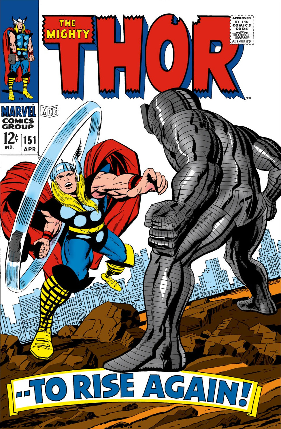
(53,410 posts)I especially like your inking technique which is the first thing that stands out once I look at the details. You depicted the cape beautifully, in the best tradition of graphic novel art. It show the billowing of motion as well as the gracefullness of cloth as it moves.
You said you just finished it? I feel like I want to see more in the cityscape and sky in the background, even if it’s creating some architectural lines that are thicker and black areas of shadows without getting much into detail. His fist looks like it isn’t connecting, as if he’s punching air.
I love your work! It has a very satisfying energy and your style shows through, especially in the facial structures. I hope you post here often! It’s fun to look at your art!
MrScorpio
(73,713 posts)He originally drew the city scape as an incidental background. I decided to keep the same motif.

I didn’t notice that you tinted the buildings a light blue. Now that I look at it again I see it. It could probably use just a touch more intensity.
I kind of like your face drawing better. It has more expression. Actually I like your drawing better in general.